Breaking Down the Principles of Design (With Infographic)
Understanding the principles of design and how they interact is vital for both new and expert designers. Implementing them purposefully is key to creating visually appealing, functional designs.
Understanding the principles of design and how they interact is vital for both new and expert designers. Implementing them purposefully is key to creating visually appealing, functional designs.
While there’s plenty of debate over how many principles of design are out there (and even what they are), there are 12 that appear regularly on the list of principles. These 12 principles, explained in the infographic below, include contrast, balance, emphasis, proportion, hierarchy, repetition, rhythm, pattern, white space, movement, variety, and unity (there are also some additional Gestalt principles of design).
These principles are often talked about separately, but in practice, they work together to create a design that’s visually appealing and makes sense to the user. Expert designers understand how the principles support, reinforce, or even contrast with each other to create the desired effect.
Implementing the Principles of Design
Once a designer understands the basic design principles, they can more intentionally combine those principles to create designs that are aesthetically pleasing and functional.
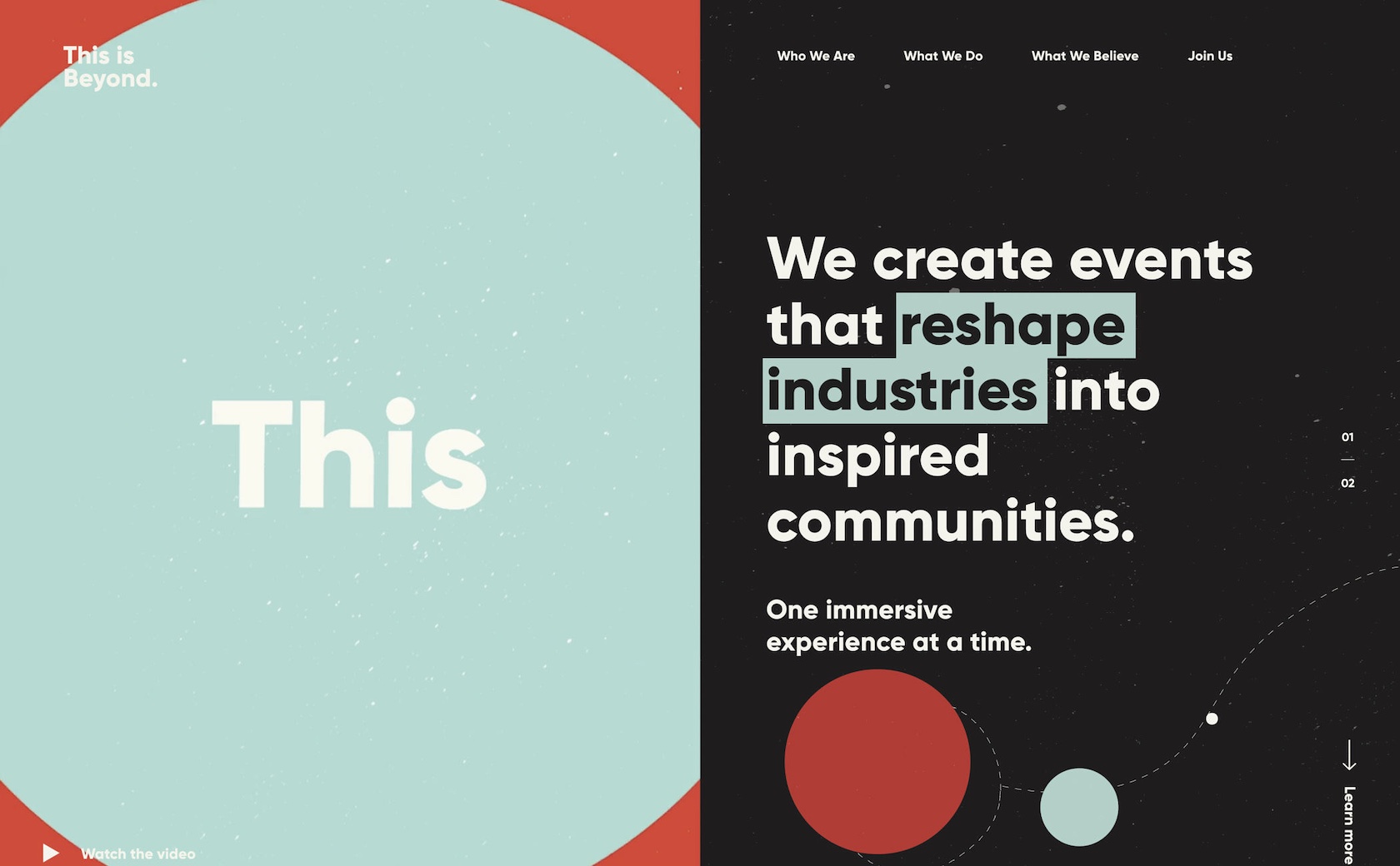
For example, contrast can be used to create emphasis.

Highlighting “reshape industries” in a contrasting color draws the reader’s eye to that particular bit of text, emphasizing it and setting it apart from the surrounding text.
Another way that emphasis can be achieved is through proportion.

Making “Problem Solvers, Idea Makers & Astronauts” significantly larger than other text on the page places the emphasis on that text.
Repetition can be used to create a sense of rhythm on the page. And that doesn’t always mean a regular or alternating rhythm. Repetition, when done intentionally, can be used to create a random rhythm.

The repetitive shapes in the background of this site create a sense of random rhythm due to their varying sizes, colors, and placement.
White space doesn’t necessarily have to be completely white or free of pattern. In fact, subtle patterns can add visual interest to white space while still allowing it to function as a sort of visual “breathing space” within a design.

The subtle grid pattern in the background of this design adds some visual interest without being overwhelming to the eye.
Variety can help create a sense of movement in a design, depending on how it’s used.

The variety of shapes in this design and their fairly random layout create a sense of chaotic movement that leads the viewer’s eye to the center.
Repetition generally creates unity in a design without any extra effort on the part of the designer. But used intentionally, it can take that unity to a higher level.

Take the white backgrounds of the photos, consistent typography, and repeating image sizes and layout in this design. The repetition of common elements of design creates unity among various categories of products that might seem disjointed otherwise.
Design Principles Don’t Exist in a Vacuum
Combining design principles isn’t just limited to two at a time. Most truly great designs combine at least half of these elements, and sometimes more.

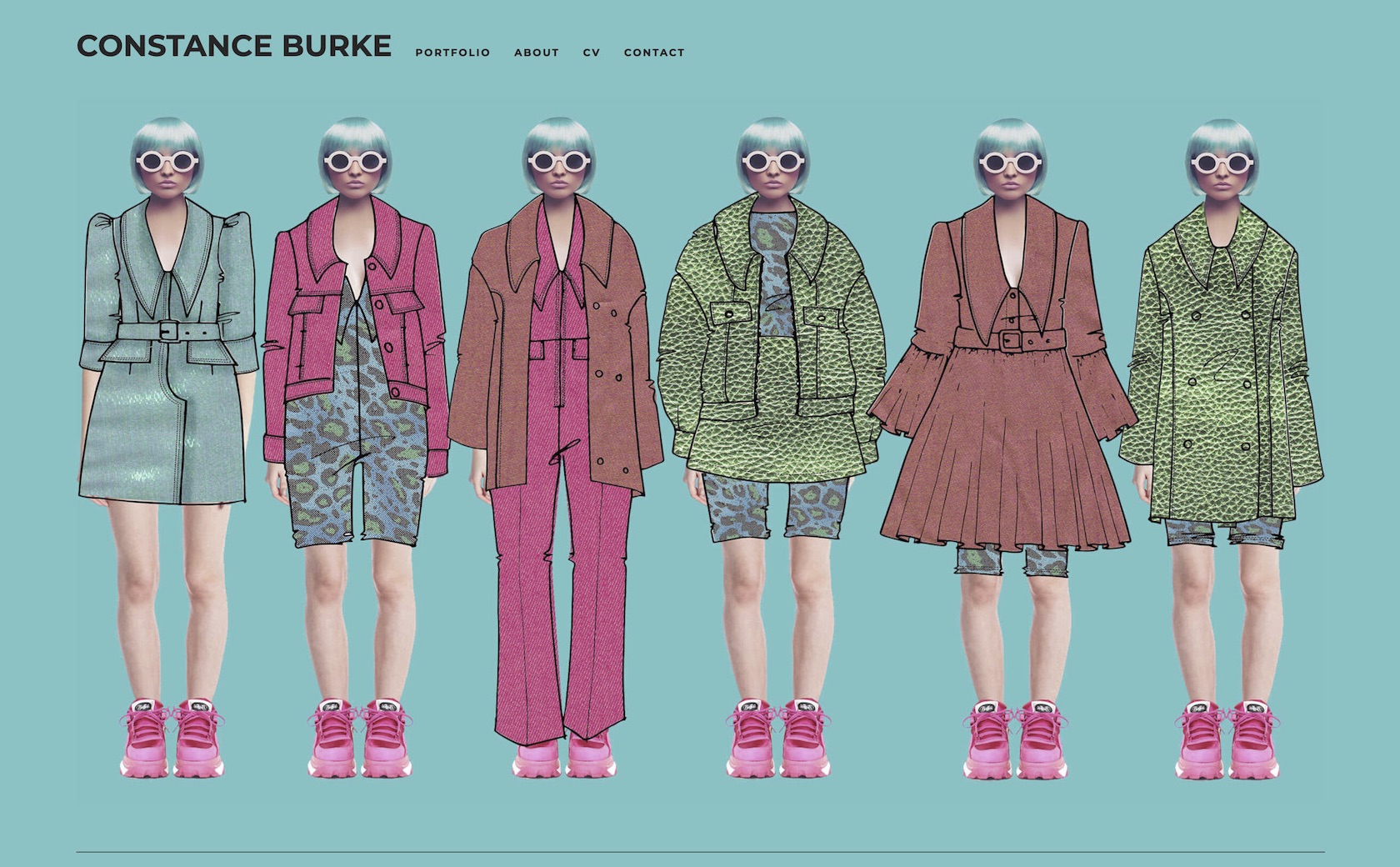
This website uses a variety of principles: contrast between the hot pink and green; repetition in the patterns being used and consistent shoes, haircut, and sunglasses; unity among the various outfits (which is further reinforced by the repeating patterns); and variety in the styles of outfits. It’s a strong design statement that follows multiple principles to create a visually appealing and eye-catching website.

Here’s another example of a design that uses multiple principles effectively. The large header creates emphasis on that particular text, while the smaller type appears less important due to proportion. The shapes in the background create a sense of random rhythm and movement, while the similar color scheme between them creates unity. Stronger and larger shapes on the right balance the text and white space on the left.
Some designers follow these principles without even realizing they’re doing it. Other times, a designer can’t quite put their finger on why a design isn’t working, but when they consult these principles they can often find the solution.
Understanding elements and principles of design and how they interact with one another is of paramount importance for both new and expert designers alike. Implementing them purposefully and intentionally in design projects is key to creating visually appealing and functional designs.

Further Reading on the Toptal Blog:
- The Principles of Design and Their Importance
- Exploring the Gestalt Principles of Design
- Mastering Another Dimension: An Isometric Illustration Tutorial
- How to Use Powerful Gestalt Principles in Design (with Infographic)
- Design Principles: An Introduction to Visual Hierarchy
- Design Foundations – A Guide to Visual Hierarchy (with Infographic)
Understanding the basics
What are the principles of design?
There are twelve basic principles of design: contrast, balance, emphasis, proportion, hierarchy, repetition, rhythm, pattern, white space, movement, variety, and unity. These visual and graphic design principles work together to create appealing and functional designs that make sense to users.
What is the purpose of principles of design?
The principles of design influence the way users view and interact with a design. When implemented purposefully, they can be used to create an emotional impact on the user, as well as enhance the overall user experience.
What is harmony in visual design?
Harmony is created when visually similar elements are used within a design, similar to the principle of unity. Harmony is aesthetically pleasing to the person viewing the website in which it is used, and can create a sense of consistency.
What does balance mean in design?
Balance refers to how elements are distributed along a center line in a design. Balance can be either symmetrical (with elements are similar on either side) or asymmetrical (where elements aren’t similar and may be distributed along an off-center line).


