Responsive Design: Best Practices and Considerations
The market share for mobile and desktop browsing is about 50/50. For designers, this means responsive design is more important than ever, as users expect a seamless experience across all platforms and screen sizes.
The market share for mobile and desktop browsing is about 50/50. For designers, this means responsive design is more important than ever, as users expect a seamless experience across all platforms and screen sizes.

Daniel Schwarz
Daniel is a designer and developer by background, an author, and a collaborator with Adobe and InVision.
Expertise
Responsive websites are websites that adapt to all screen sizes and resolutions, not only on desktop but also on mobile, tablet, and sometimes even TV.
According to Statista, mobile traffic was responsible for 52.64% of all global traffic in 2017, meaning that a website not well optimized for mobile devices is losing out on approximately half of its traffic. By the end of 2018, it’s expected that the global traffic share for mobile devices will grow to 79%, which is an exceptional increase.
Businesses without a mobile website are falling behind at an alarming rate, because 8 in 10 visitors will stop engaging with a website that doesn’t display well on their device. It’s way too easy for users to hit the back button and try a rival business instead, and Google even ranks websites that don’t use mobile responsive design lower in their search.
You can take Google’s mobile-friendly test here.
Does any of this mean that mobile is more important than desktop? No. 83% of mobile users say that they should be able to continue the experience on desktop if they wish.
Take a look at this mobile-optimized version of eBay vs. what it would look like if it weren’t mobile-optimized. Would you even consider the non-optimized version?
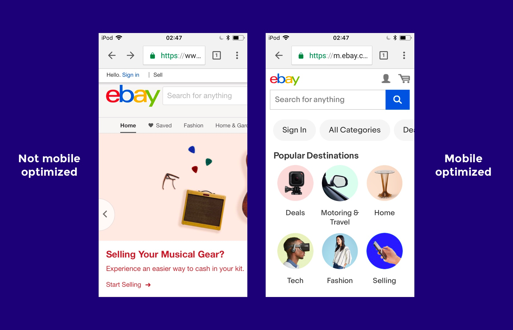
In order to design websites that can compete on today’s internet, web designers must be experts at responsive website design (RWD). Where should they start?
A Mobile-first Approach to Responsive Web Design
Mobile-first web design means designing the mobile website first and working up to the desktop version. There are a number of reasons why this approach works well.
- Mobile websites have more usability concerns (this is mostly due to the lack of screen real estate), so it’s practical and more efficient for the primary focus to be on mobile design.
- It’s easier to scale up the mobile version than it is to scale down the desktop version (again, because of the lack of space on mobile websites).
- Mobile-first web design helps to reevaluate what’s visually and functionally necessary.

Designing a website as a mobile-first responsive site forces designers to ask a number of important questions because there is less screen real estate to work with. Here are the questions that need to be asked:
- Is this feature/function really necessary?
- How can we design something minimalist for mobile first that will later scale up well for desktops?
- Is this visual effect worth the time that it takes to load on mobile?
- What’s the primary objective, and what visual elements help users achieve it?
We’ll take a look at some responsive website examples in a moment. For now, let’s talk about which devices, screen sizes, and web browsers are relevant today.
What Screen Resolutions Are Relevant for Responsive Web Design?
Here are the most common screen resolutions across mobile, tablet, and desktop users worldwide. As you can see, there is a wide range of resolutions, so neither mobile, tablet nor desktop is dominating the market share right now—what this tells us is that designers should consider all of them when thinking about responsive web design.
- 360x640 (small mobile): 22.64%
- 1366x768 (average laptop): 11.98%
- 1920x1080 (large desktop): 7.35%
- 375x667 (average mobile): 5%
- 1440x900 (average desktop): 3.17%
- 720x1280 (large mobile): 2.74%
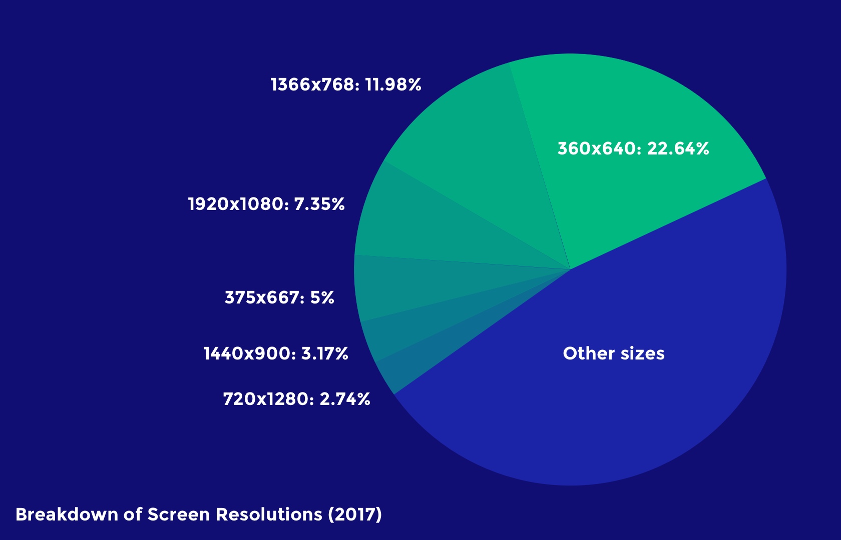
Just as with device breakdown, we should segment the data by location to match the user demographics (or anticipated user demographics) of our target audience. It’s also worth catering to resolutions that are gaining popularity, because while some screen sizes are currently not that common, they may be in the future. This will help responsive designers craft futureproof UX that will work even when the market share changes.
For example, 360x640 resolutions (which correspond mostly with Samsung devices using Android) have risen by 5.43% in the last year. Designers can use valuable insights like these to decide on key responsive breakpoints before starting a website design.
What Web Browsers Are Popular Today?
Responsive web design is about offering a seamless experience on any device, and since different web browsers render web pages in different ways, websites must be tested to ensure that they’re compatible with a variety of mobile and desktop web browsers.
Even though making a website scale to the correct responsive breakpoints is primarily the responsibility of a web developer, it’s the web designer that decides exactly how responsive UI elements will adapt to various screen sizes in order to create an optimal user experience.
Here’s a worldwide breakdown of web browser market share for mobile and desktop.
- Chrome: 55.04%
- Safari: 14.86%
- UC Browser: 8.69%
- Firefox: 5.72%
- Opera: 4.03%
- Internet Explorer: 3.35%
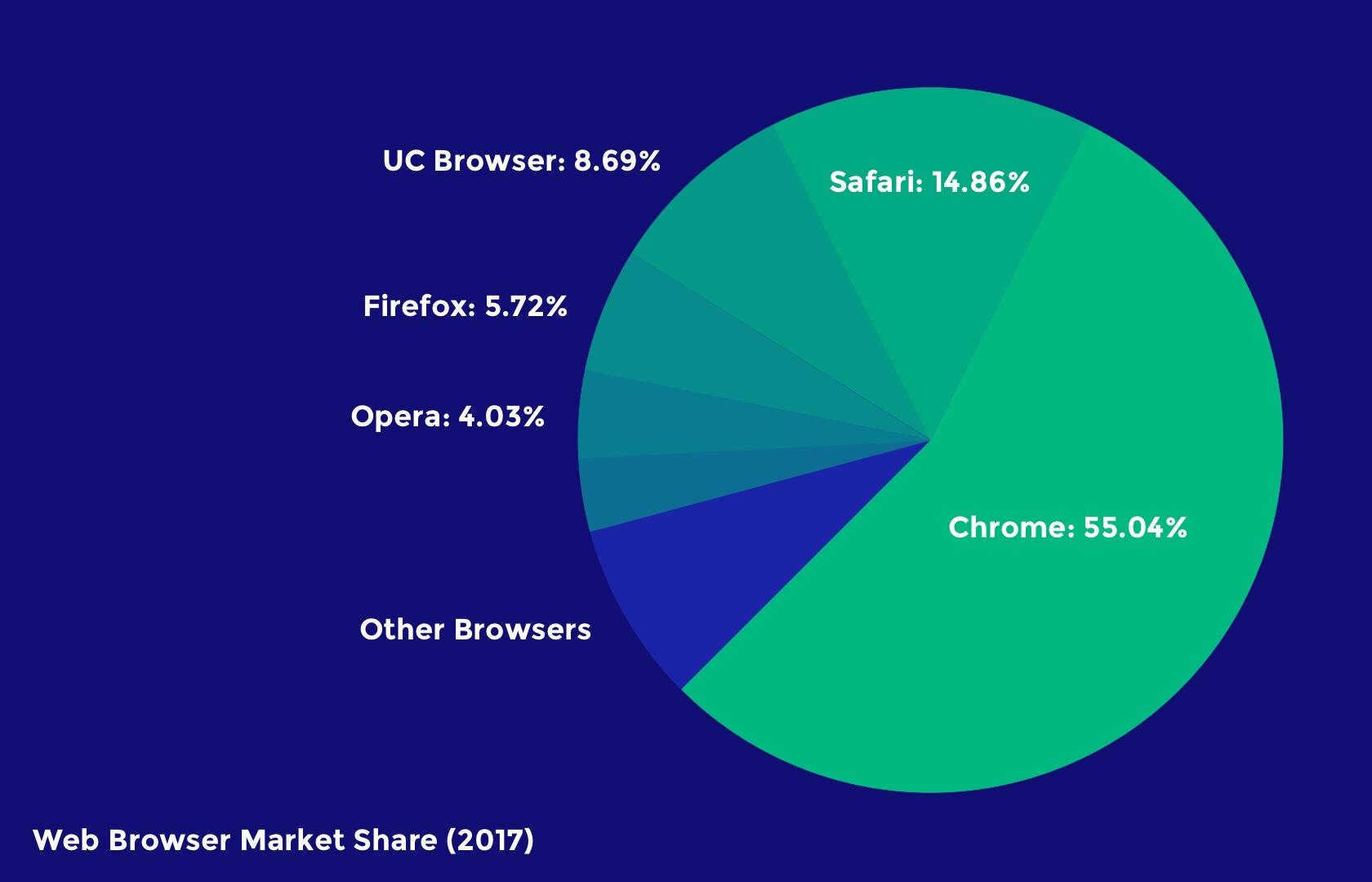
Responsive design isn’t just about “making everything fit”—it’s also about adapting to the capabilities of the device hardware and web browser as well as the device resolution. One example of this could be that, while Google Chrome supports the CSS property overscroll-behavior: (which defines what happens when the user scrolls too hard towards the edge of the viewport), it’s not supported in any other web browser.
Responsive Design Best Practices
Eliminate Friction
As mentioned earlier, a mobile-first approach to responsive web design will help designers evaluate what’s really necessary in order for the user to achieve their main objective.
As we build up to the tablet version (and later the desktop version), we can then begin to think about secondary objectives and the microinteractions, user flows, and CTAs (calls to action) that make those user objectives achievable. What’s more important is that we focus on the primary objectives of the user first and eliminate any unnecessary friction that aids neither the primary nor the secondary objectives.
A primary objective could be the purchasing of a product, whereas the secondary objective could be signing up for a newsletter (which could lead to a purchase later).
Here’s a terrific example of eliminating friction: Since mobile user interfaces are typically harder to navigate, it would be best to switch to a one-page checkout for mobile eCommerce stores and only enable multi-step checkout for desktop eCommerce stores.
Design for Thumbs
Responsive design UX is tricky in the sense that users will interact with the desktop website via clicks but the mobile version via taps and swipes. There are physical differences as well. Desktop users typically have their computers on a surface, whereas mobile users hold their devices in their hands. These differences significantly change the way mobile UI designers design tap targets and other important UI elements with which users interact.

Let’s take a look at some examples:
- People typically expect the main desktop navigation to be at the top; however, on mobile, it should be at the bottom. Thumbs don’t reach the top comfortably.
- Other interactive elements should also be easy to reach. This means keeping them in the center of the screen because it’s more difficult for thumbs to reach the sides and corners of device screens.
- So that they can be tapped with ease, important links and CTAs should have a height of at least 44px (smaller tap targets are bad for usability).
Recommended reading: The Fundamental Guide to Mobile Usability.
Take Advantage of Mobile Devices’ Native Hardware
Mobile hardware (like the device camera, or GPS services) isn’t specifically reserved for native apps, and as mentioned earlier, responsive web design isn’t just about “making everything fit.” It’s also about adapting to the capabilities of the device. In the case of mobile web design, since mobile devices have easy to use cameras, some microinteractions—such as data input—are actually easier on smaller screens as long as websites are taking advantage of the available native hardware.
Let’s take a look at some examples:
- Credit/top-up card scanning (because forms are often tricky on mobile)
- Photo-sharing on social media, because the media is already on your device
- Two-factor authentication (because you’re already on your mobile device)
- Quickly checking stocks/analytics (because mobile apps simplify information)
- Performing a web search with voice (because hands-free is easier than typing)
Make Layouts Fluid/Adaptive by Default
Not every user will have their desktop browser maximized. This means that while designers need to consider the responsive breakpoints of the devices that users are using today, they also need to account for what happens in between those breakpoints.
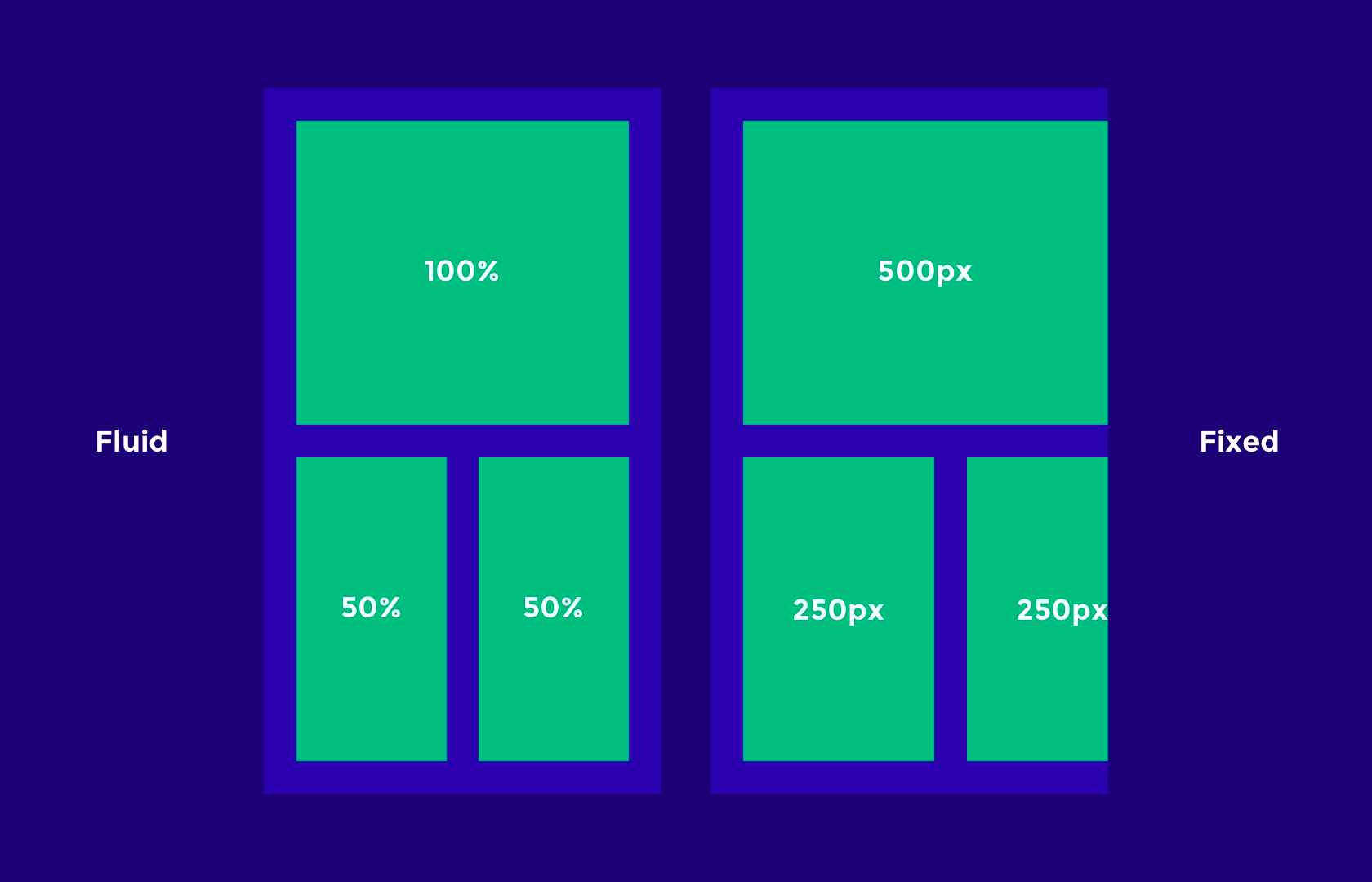
Responsive breakpoints should be used to “reflow” the layout and content to a new device, but to account for all the sizes in between (just in case), layouts need to be otherwise fluid (that is, they naturally adapt/stretch as the browser resizes).
Keep these tips in mind when designing fluid/adaptive layouts:
- Percentage units will allow elements to be fluid.
- Setting minimum and maximum widths can enable the “but don’t go smaller/bigger than this” scenario.
- SVG image formats can be scaled up and down without losing quality, and are resolution-independent (as opposed to JPGs and PNGs, which are not).
Don’t Forget About Landscape Orientation
We talked about specific responsive breakpoints earlier, but we also need to consider that those mobile viewports can be displayed in landscape orientation as well. While implementing a fluid layout will technically make the content adaptive, losing a fair chunk of the portrait viewport can be a hindrance to the usability and accessibility.
Navigations are usually safe (sometimes they’re better, actually, since users typically navigate landscape orientation with two thumbs), but scrolling becomes significantly harder, which is less than optimal since the user is required to scroll more on landscape.
Designers may want to consider designing for landscape breakpoints as well; for instance, tiled elements that stack vertically on mobile could be displayed as a slider with left and right navigation buttons, meaning the user doesn’t have to scroll.
Remember, Typography Can Be Responsive Too
Even though UX designers typically use pixel units to design websites, on the actual web, one point doesn’t necessarily equal a pixel anymore, because different devices have different resolutions. The iPhone X, for example, has 458 PPI (Pixels Per Inch), so where pixel sizes are getting smaller, we’re able to achieve crisper graphics in the same physical space (Apple calls this “Retina” technology, and Android calls it “hDPI”).
This means that a 16px font size, for instance, would look bigger or smaller on some devices depending on its resolution. Web developers will typically use em units to define font sizes, which are a type of responsive unit where 1em is equal to 1 point.
Design handoff tools like Zeplin, Sympli, Marvel, and InVision can help designers collaborate with developers on matters that are a joint responsibility. While designers execute the design, and developers execute the code, as a whole the product design workflow is a team effort that requires solid communication.
Responsive Design Performance Optimization Tips and Best Practices
Responsive web design isn’t just about how it looks but also about how it acts and feels. Adapting websites so that they load faster on the intended device is equally important.
Lazy Load Non-vital Images and Videos
Images and videos are what make up a large chunk of the total download size of a website, but you don’t need to load them all at once. There are two scenarios where the rendering of media can be delayed: Below-the-fold content can be loaded as the user scrolls below the fold, and render-blocking media should be made to download only after the layout and content has downloaded. This practice is called lazy loading, where the loading of heavy, non-important elements is delayed to improve page performance.
Conditional Loading
Some website elements are not intended for mobile users, or at least aren’t worth the extra cognitive load. We want our mobile websites to be simple, so it makes sense to hide elements in certain scenarios. That being said, we have to make sure that we aren’t wasting browser resources and bandwidth by loading these elements even when they’re hidden; hence, it’s best practice to only include these elements in certain conditions.
Once again, a developer can achieve this with code; however, designers can improve page performance by communicating the conditions of when and where certain elements should and shouldn’t exist.
Responsive Images
As mentioned earlier, some devices display more pixels per inch, which can result in images becoming blurry if they’re not exported at the correct resolution. Depending on the resolution of the device, some will require images at double (@2x), triple (@3x), and even quadruple (@4x) the size. Web browsers now support the <picture> element, which chooses the correct image resolution depending on the device.
Designers crafting responsive websites can tailor images to the correct device by making sure to export at all the resolutions used on today’s devices (if you’re unsure, ask your developer—communication is key when it comes to responsive web design).
Conclusion
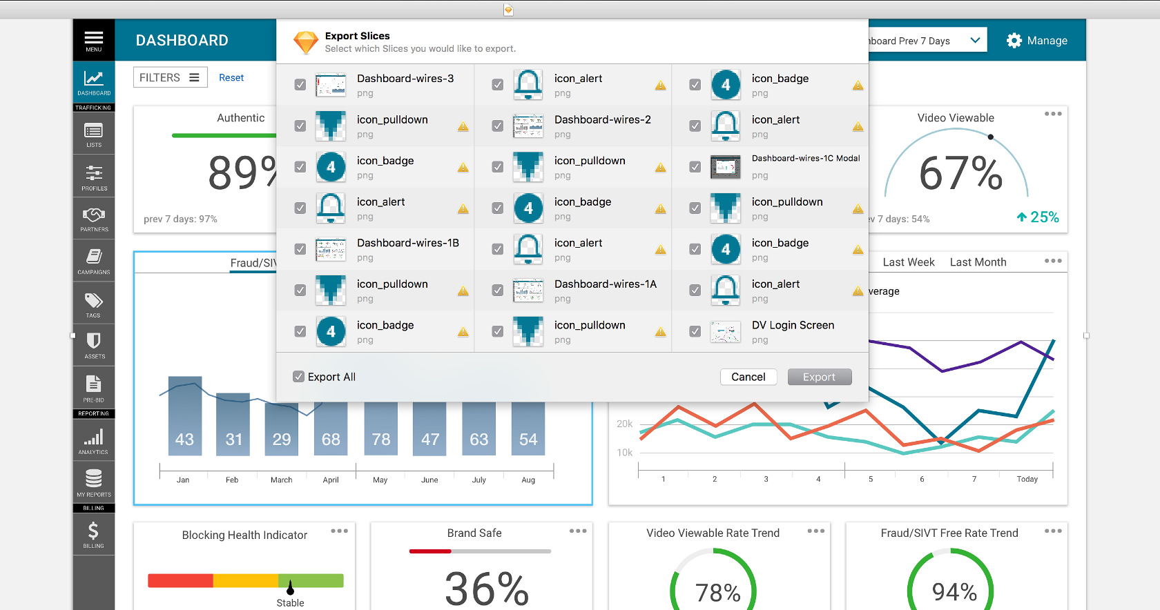
Wireframing can help to iron out the creases early in the design process, and this works well when taking a mobile-first approach to responsive web design. Perhaps there’s a responsive breakpoint that needs some extra attention, or maybe there’s a concept that just isn’t effective in terms of mobile responsiveness. It’s better to find the bumps in the road sooner rather than later (i.e., before adding visual aesthetics).
Modern design tools like Adobe XD, Marvel, and InVision enable teams to test prototypes on real devices, discuss feedback in context, and generally collaborate as a team until the layout works in all scenarios.
Employing a lean UX workflow where responsive design is driven by internal testing and feedback will ensure that the user experience works seamlessly across all platforms and screen resolutions before being presented to a real user for the first time.
Further Reading on the Toptal Blog:
- Responsive Design Is Not Enough, We Need Responsive Performance
- Responsive Web Design Media Query Examples Explained
- One Size Fits Some: A Guide to Responsive Web Design Image Solutions
- Mobile UX Design Constraints, Best Practices, and Working With Developers
- UI Design Best Practices for Better Scannability
Understanding the basics
What are breakpoints in responsive design?
Breakpoints are the key moments when a design is adapted to a new screen size; for example, a breakpoint could be defined at 320px, which is the horizontal size of most mobile device viewports.
What is responsive web design?
Responsive web design entails the process of designing websites that adapt to all devices, platforms, and screen sizes in terms of both form and function.
What does it mean to be mobile friendly?
Designing mobile friendly websites means to adapt websites to mobile devices. Google defines mobile friendliness by whether or not tap targets meet the minimum requirements of being at least 44x44px, whether fonts are large enough to read, and whether or not content is cut off by the viewport, among other things.
