Simplicity Is Key: Exploring Minimal Web Design
Designers who approach minimalist UI design as being easy are often surprised at the amount of effort, time, and skill required to create a product that can achieve its aims while remaining truly minimalist.
Designers who approach minimalist UI design as being easy are often surprised at the amount of effort, time, and skill required to create a product that can achieve its aims while remaining truly minimalist.
Minimalist web design isn’t so much a specific design aesthetic as a set of principles or guidelines for design. In practice, following these principles results in a simple website design that uses only the most essential elements to achieve the desired outcome from visitors.
Along with the ubiquitous concept of “less is more,” these principles include using techniques such as a limited color palette and negative space.
Less is More with Minimal Web Design
“Less is more” is probably one of the most oft-heard minimalist mottos, whether talking about web design or any other form of minimalism. But what does it really mean in the context of minimalist web design? How does design simplicity express itself on a website?
Sometimes it’s easier to figure out what minimalist UI design is by first looking at what’s not minimalist. Here’s one extreme example:
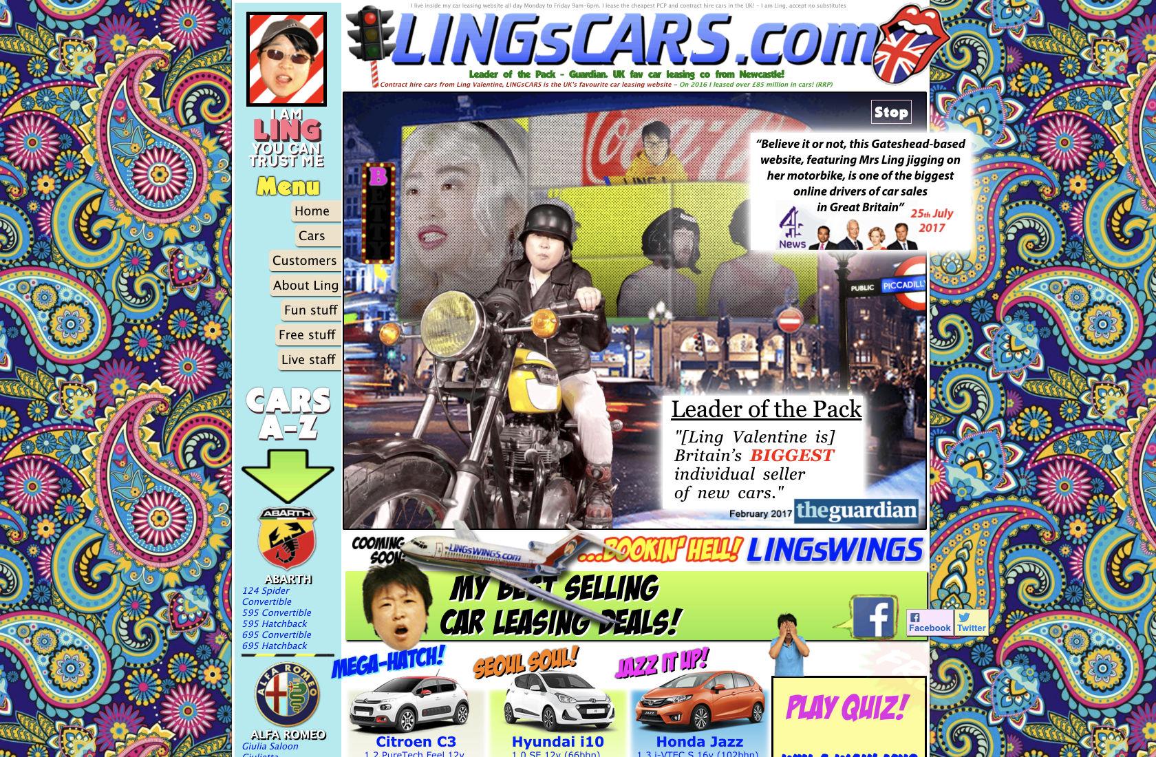
While the website for Ling’s Cars is apparently incredibly successful, it regularly makes lists of the worst-designed sites in existence. There’s just so much going on. Anyone can look at it and immediately know it’s not minimalist.
Nevertheless, there are plenty of well-designed sites that are also not minimalist. Take this one for example:
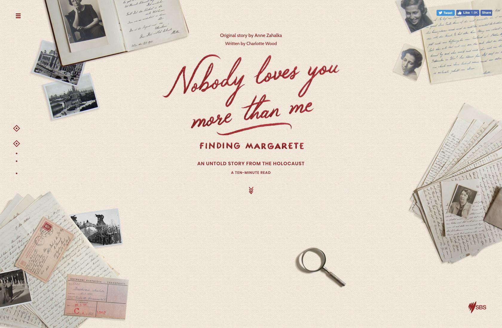
This site is beautifully designed, but between the animations, the textured background, the collage elements, and typography, it’s definitely not minimalist. It’s not necessarily that any particular element alone makes it not fit the minimalist web design definition— it’s more the combination of all of those elements.
Minimalist design focuses on creating compelling designs with less going on. One key to achieving this is to keep removing elements until the design breaks. “Breaks” in this case should be interpreted as no longer fulfilling the needs and wants of the user.
Minimal Web Design Lets the Content Stand Out
One of the most compelling arguments in favor of minimalist web design is that it lets the content really stand out and shine. This is why a simple website design is the first choice of so many artists, photographers, and even some writers. They want their creative content to be the center of attention, rather than design elements created by someone else.
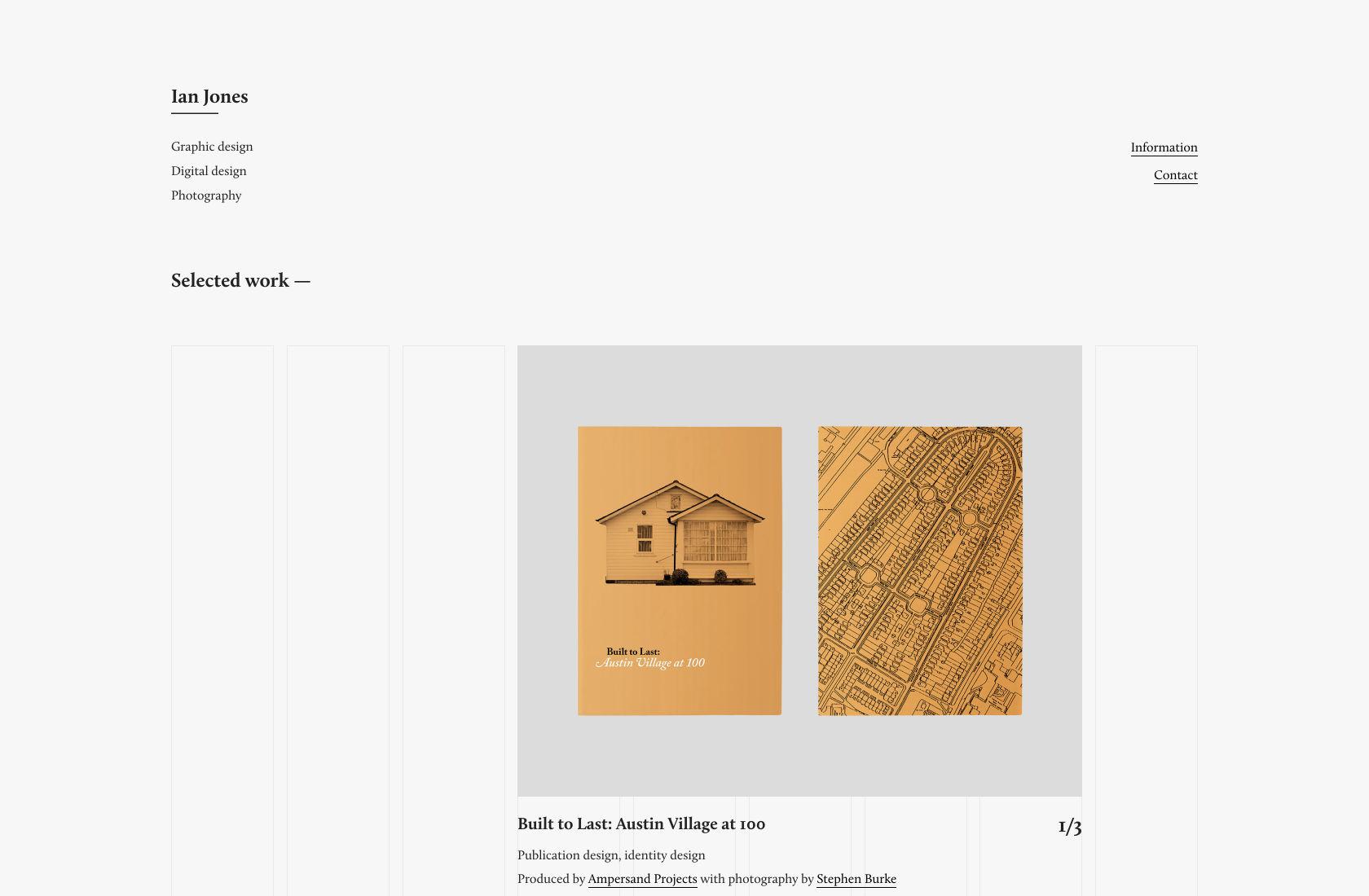
Take Ian Jones’s website for example. He does graphic and digital design, as well as photography. His website places the focus squarely on the content, while also incorporating some interesting design elements (like the grid background) and subtle animations. The end result is a minimalist UI design that makes his work shine.
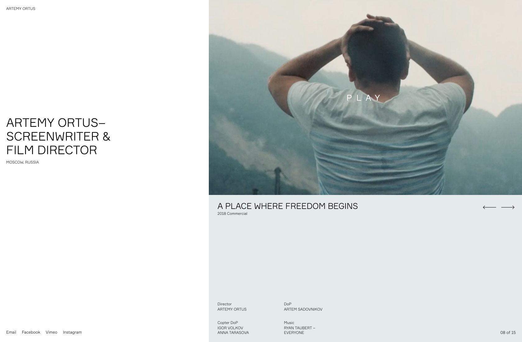
Screenwriter and film director Artemy Ortus’s website is another stunning example of minimalist design that places focus on his work. The slideshow element creates a ton of visual interest without creating any design clutter.
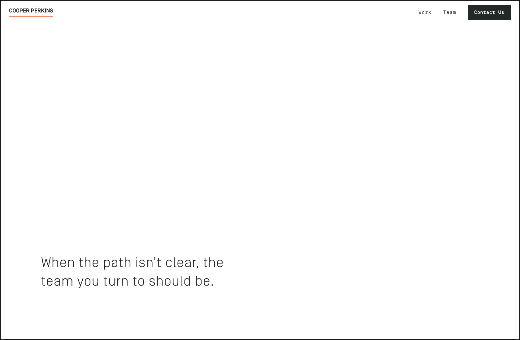
Cooper Perkins’s website is another beautiful example of minimalist UI design that uses animations to create interest without clutter.
Every UI and UX Decision Must Be Intentional
Minimalist design, on its surface, looks like it might be easier to master than design styles that appear more complex. In fact, the opposite is generally true.
Minimalist design puts every single design element front and center. Each choice the web designer makes is on display for every visitor to see. While more visually complicated designs can make small mistakes or missteps practically invisible (a welcome benefit for many beginning designers), simple website designs don’t offer the same coverage.
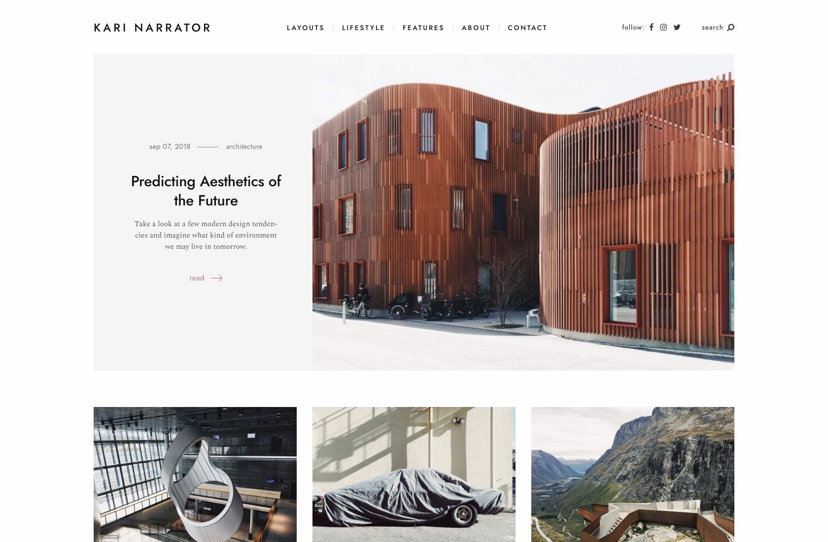
The Narrator WordPress theme is a great example of a site that has put a lot of thought into the small elements that tie everything together. Without adding visual clutter, lines, arrow symbols, and simple gray backgrounds for different elements give the site a polish that is sometimes lacking in minimalist designs.
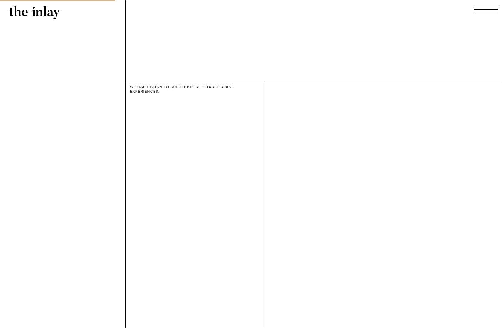
The Inlay’s website appears incredibly minimalist at first glance. Scrolling reveals animations and more complex screens, but the overall extreme minimalist vibe persists throughout.
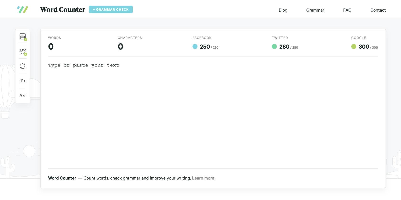
Apps can also benefit from minimalist design. This Word Counter app’s simple design makes it very easy to see all of the features it offers without requiring more formal onboarding. It’s easy to tell that every design decision made was intentional, with an emphasis on usability.
Make Use of Negative Space
Possibly one of the most important elements of a good minimalist web design is the use of negative space. Minimalist design is just as much about what isn’t there as what is.
Negative space, also referred to as “white space,” is the empty or open space around design and/or content elements that gives them definition. Granted, sometimes this space isn’t always truly empty, and may be filled with a background texture, pattern, or color. But it’s still space that isn’t being “used” in the same sense as other elements of the site.
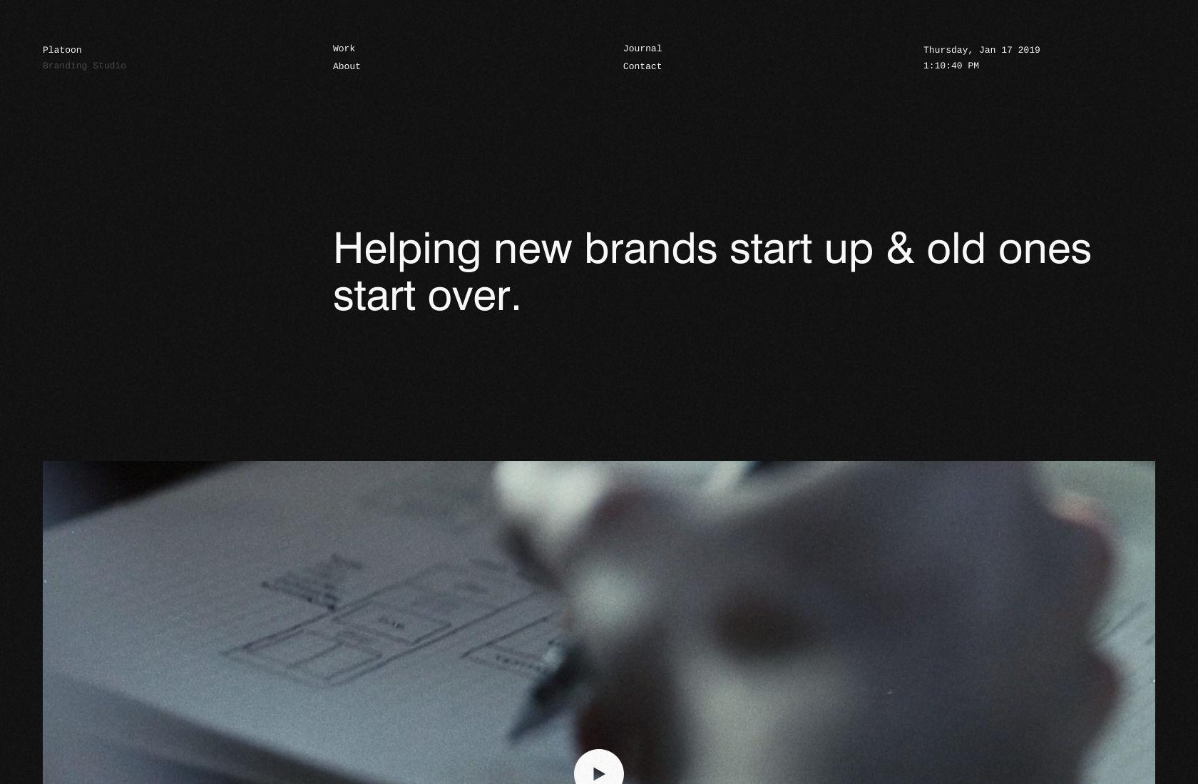
Platoon Branding Studio uses ample negative space around the typography in their header, making it stand out and immediately draw the eye.
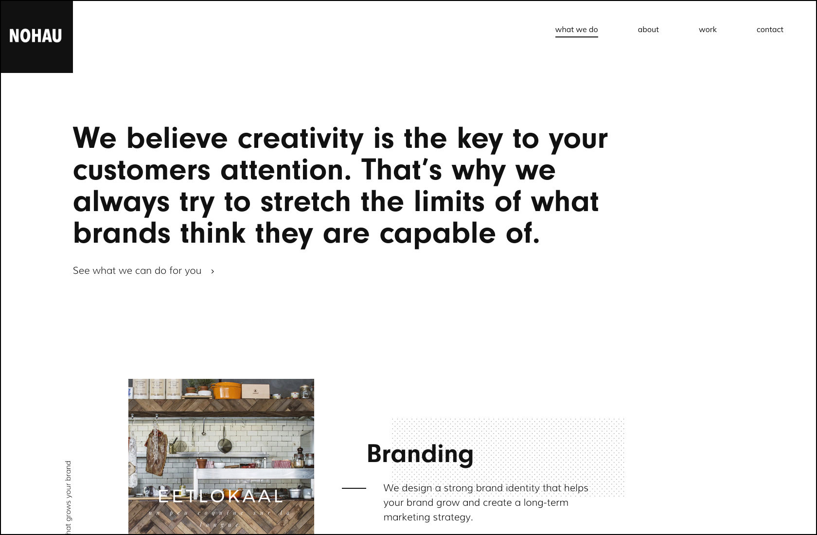
Nohau’s header is similar, with plenty of white space surrounding their type.
Negative space can also be used to create interesting shapes or images within a design that may not be immediately obvious.
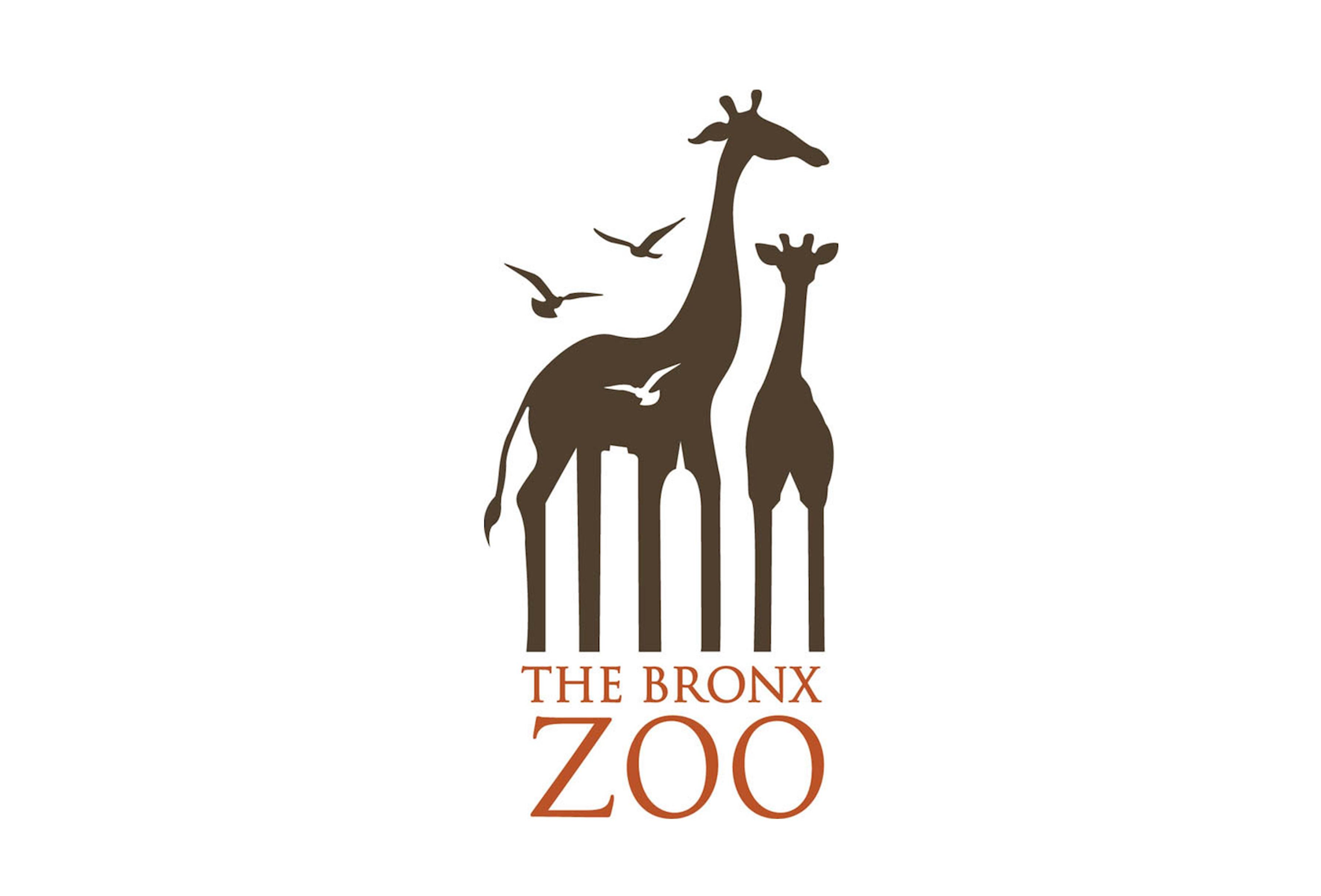
This logo from The Bronx Zoo and plays with the spaces between the giraffes’ legs. They are silhouettes of skyscrapers.
Create Drama with Photography, Typography, and Contrast
Just because a design is simple or minimalist doesn’t mean it can’t also be dramatic. Some of the most common ways to create drama in a minimalist design include the use of photography, typography, and contrast (both in terms of color and between design elements).
Large photos, including photo backgrounds, are a great way to add plenty of visual interest to a design, and if done right can definitely fit into a minimalist design aesthetic. For the most impact, it’s best to avoid photos that are really busy. Photos in minimalist design should be at least somewhat minimalist themselves (including a simple color palette and use of negative space).

The Wildsmith Skin website uses a large photo on their landing screen, along with other striking typography. It immediately catches the eye, and the split photo is a choice that is less commonly seen.
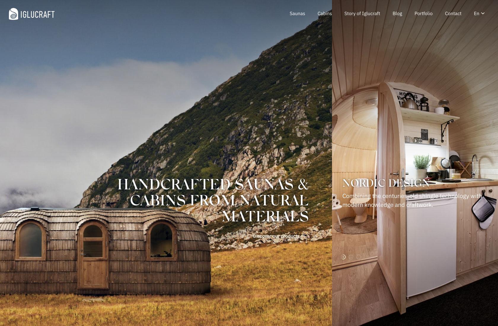
Iglucraft is another excellent example of a site that uses big photos, not just in the main landing screen, but throughout the site. The transition animations are considered and add to the overall user experience.
In addition to large photography, large illustrations and videos can also be used in minimalist web designs.
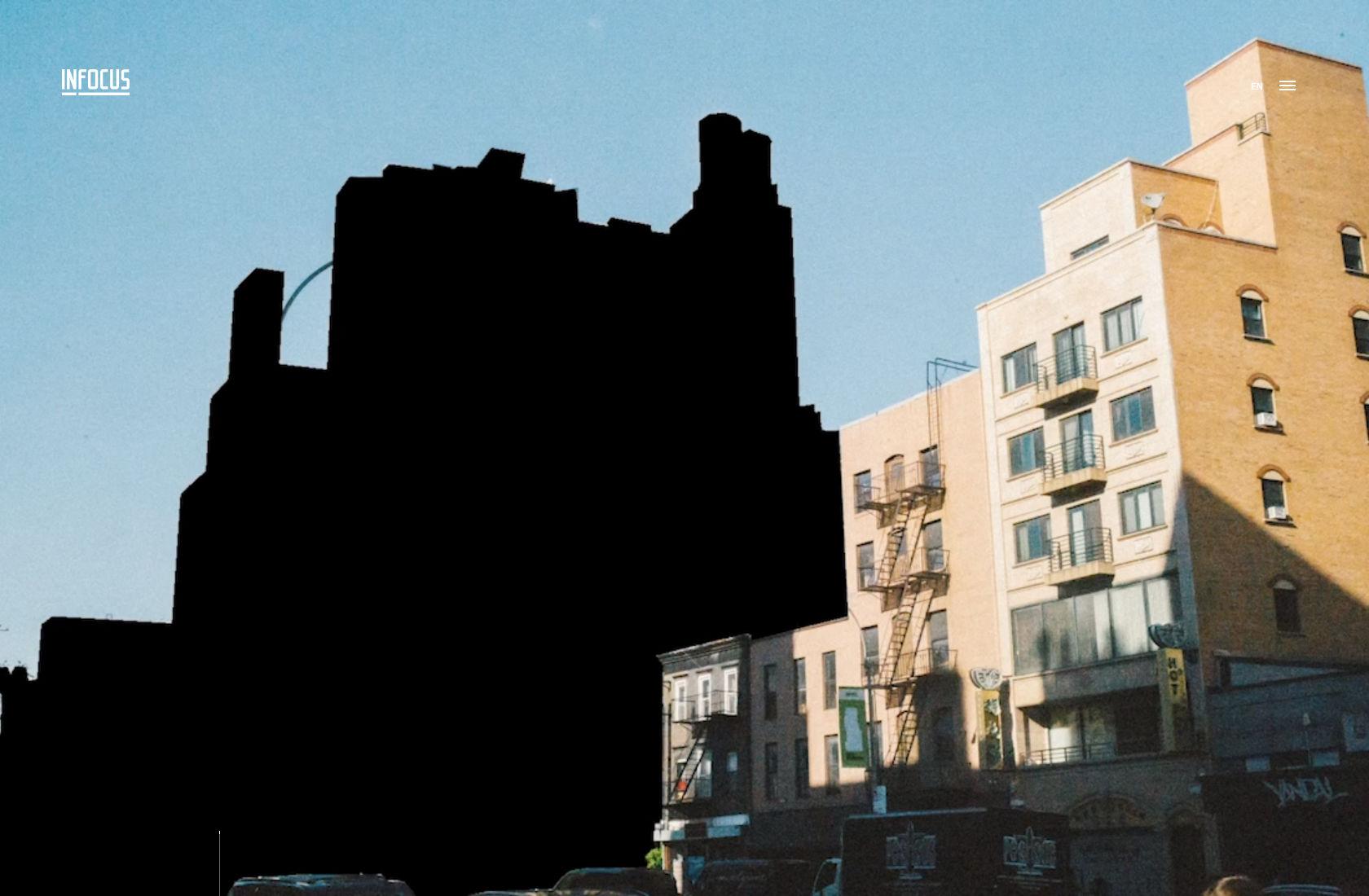
The In Focus website uses animations, illustrations, and videos in their background. While the site isn’t immediately intuitive, it is a lot of fun to explore and use.
Typography is another area where minimalist designers are doing some really cool things.
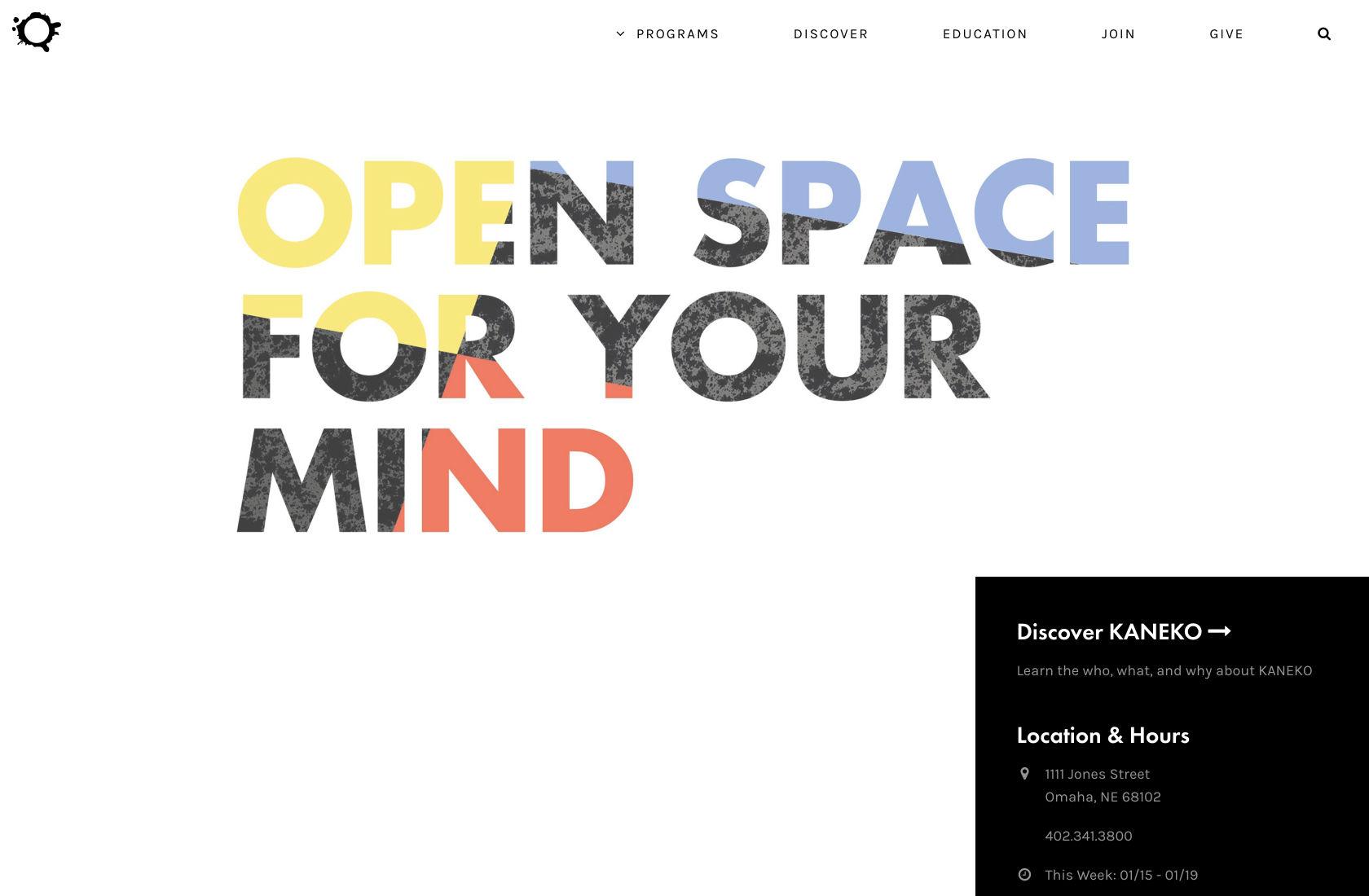
Take the main typography for KANEKO, an arts and culture nonprofit. The pattern and color overlay on the type in their header is just as visually stimulating as many photos or illustrations would be but in an entirely different way.
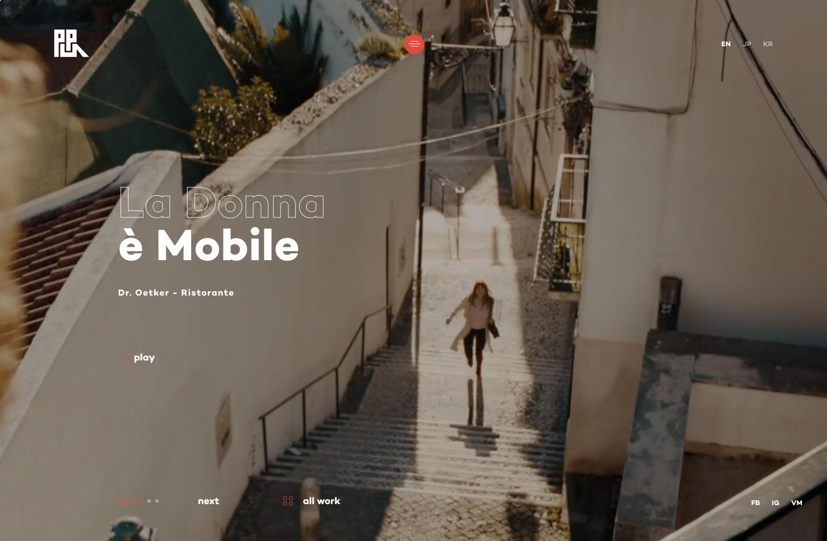
Production Portugal uses a mixture of solid and line typography over large video backgrounds, making use of two techniques that add a lot of drama.
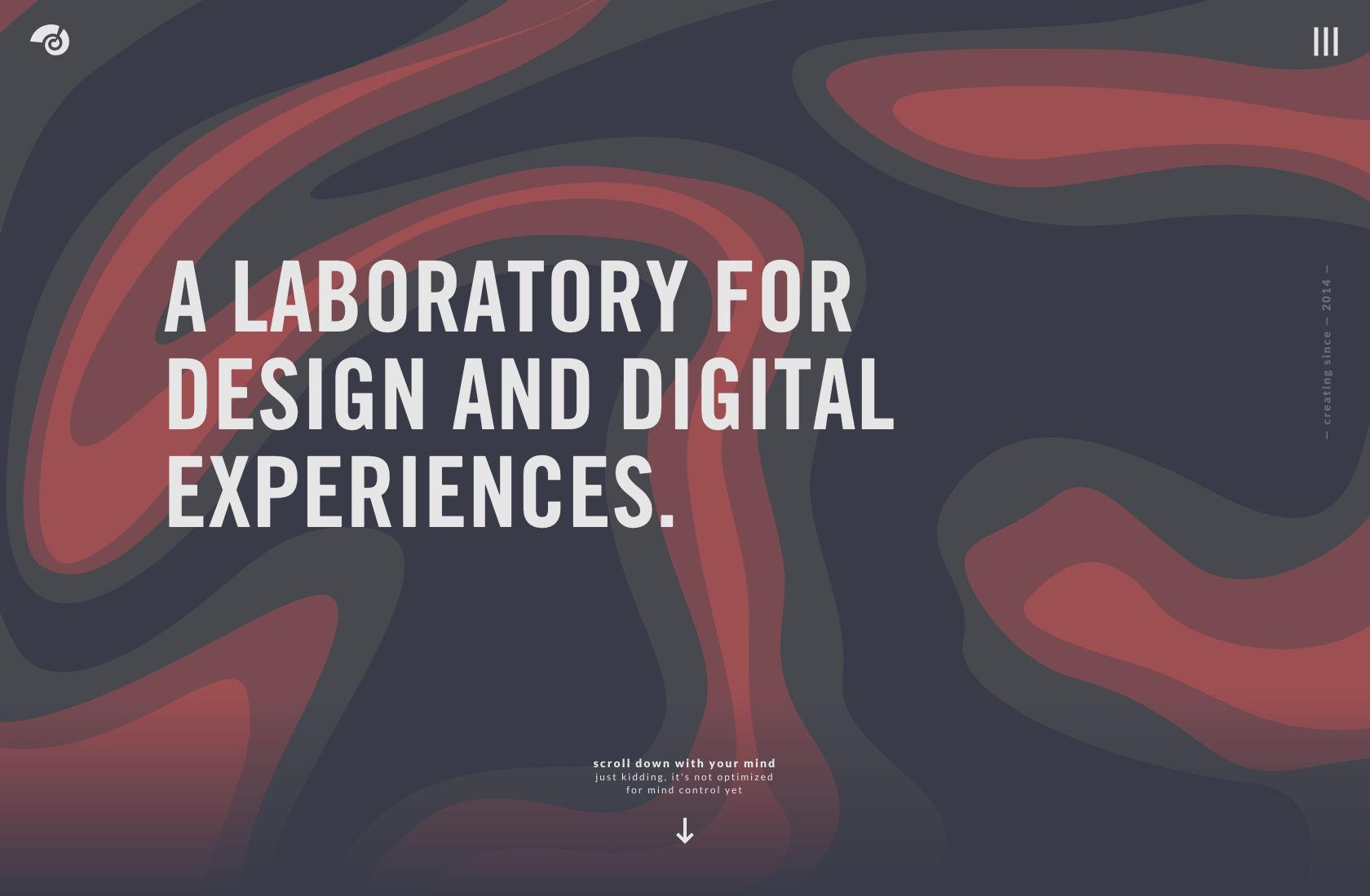
Kobu’s website not only has good contrast between the colors used on each screen, but also between the various screens used throughout. It sets apart each project as its own distinct feature.
Typographic Hierarchy
Since every decision must be deliberate in a minimalist web design, it’s important to spend time creating a clear sense of typographic hierarchy. Typographic hierarchy is especially important when the type must differentiate different types of content without much help from other design elements.
For example, when a person visits a minimalist website, they should be able to discern the title, headings, body, and navigation immediately, at a glance, without necessarily needing to read the content. The best way to achieve that is through clear contrast between those elements.
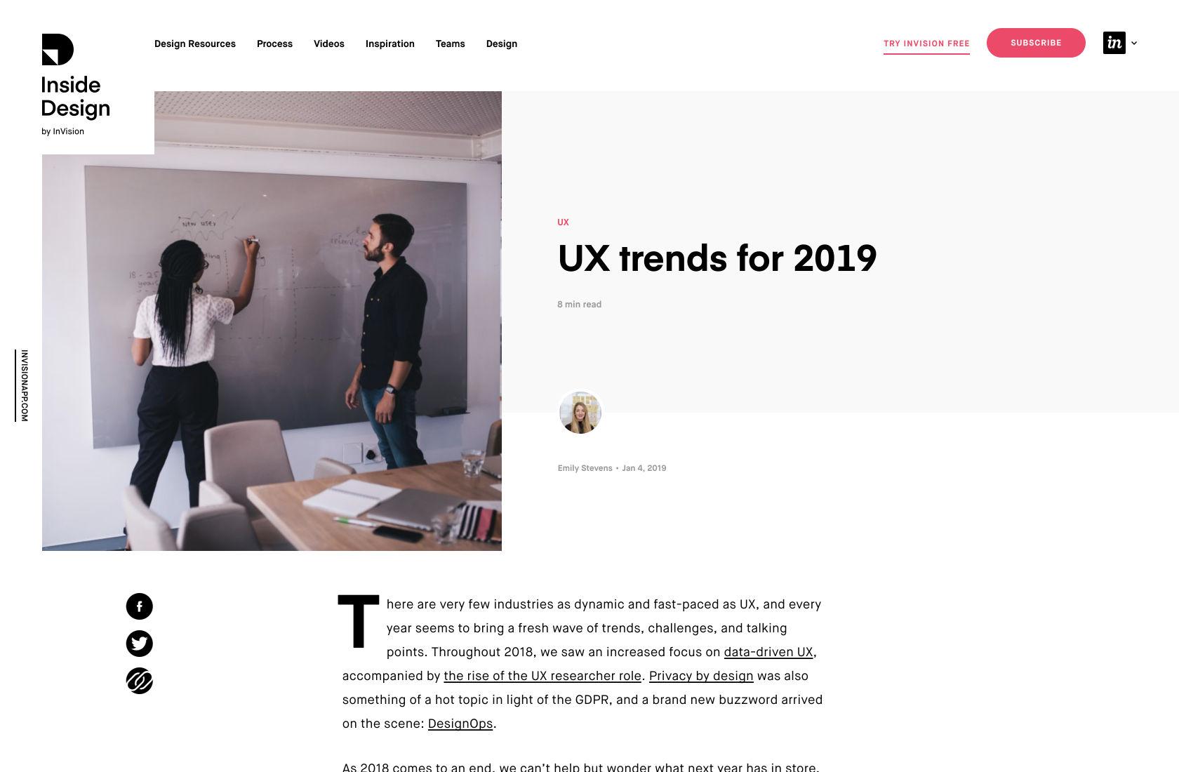
InVision’s Inside Design blog uses clear typographic hierarchy to set apart the title, headings, and body copy.
While placement and techniques such as using different colors for different typographic elements go a long way toward achieving that goal, delineating the various elements via size, weight, and style are at least as important.
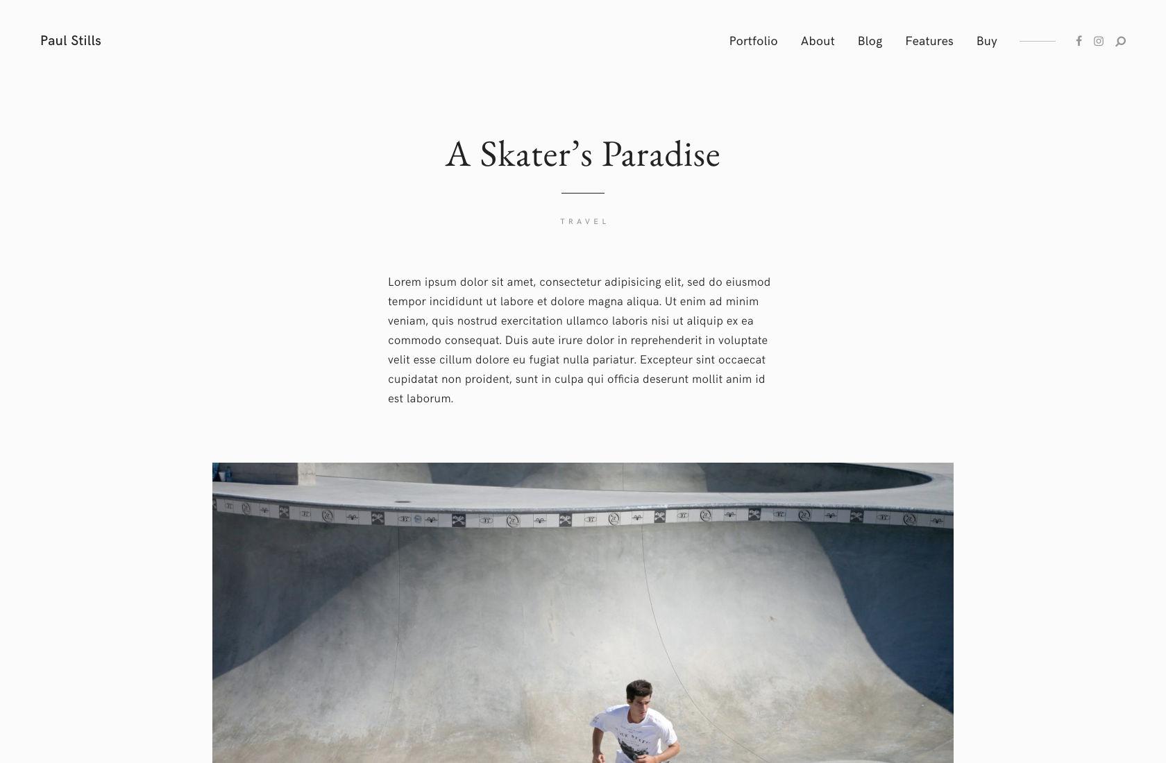
The Stills WordPress theme uses clear typographic hierarchy to differentiate between headings and body copy.
Even the most minimal designs should generally include at least three levels of typographic hierarchy: Headings (which can also be used for the title), subheads, and body or text copy. Oftentimes, there are multiple subhead levels, but it’s by no means required. Some sites get away with using two levels (and some even opt to use only one, though in most cases it’s not recommended).
Keep Navigation Simple
One area where a lot of minimalist sites break down is in creating user-friendly navigation. This is particularly common on more complex sites with a lot of pages.
Top navigation bars are still a mainstay in minimalist UI design. Simple text links, sometimes with submenus, are the most common. The typography, colors, shapes, and other design elements can be adapted to fit the overall look and feel of the site. But there are other options.
Two other very common navigation design patterns found in minimalist web designs are the hamburger and kebab menus. Hamburger menus consist of three or four horizontal lines (variations sometimes use vertical lines, but the idea is the same), while kebab menus consist of three dots.
Despite having been fraught with usability problems, the infamous hamburger menu—which has become a universal shortcut to hide navigation—is here to stay because it reduces visual clutter.
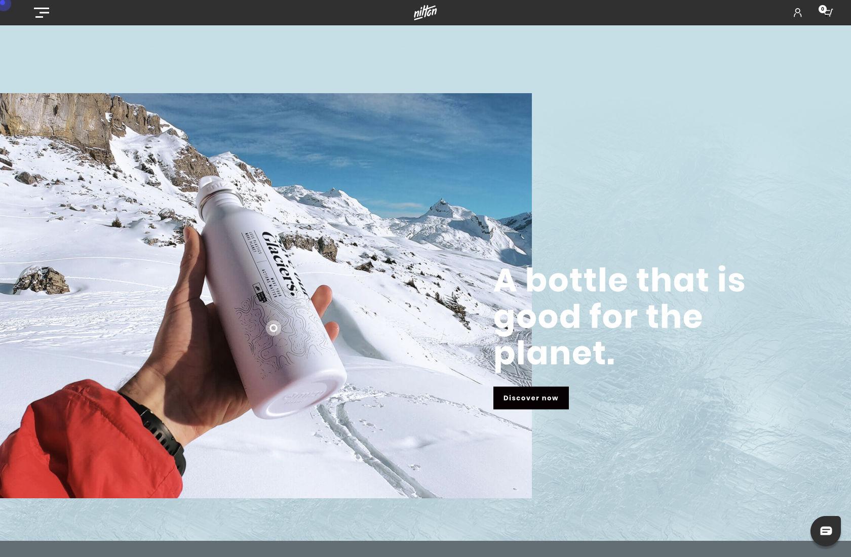
Nilton Clothing uses three offset lines to create their hamburger menu, a choice that has become a popular alternative to the three matching lines.
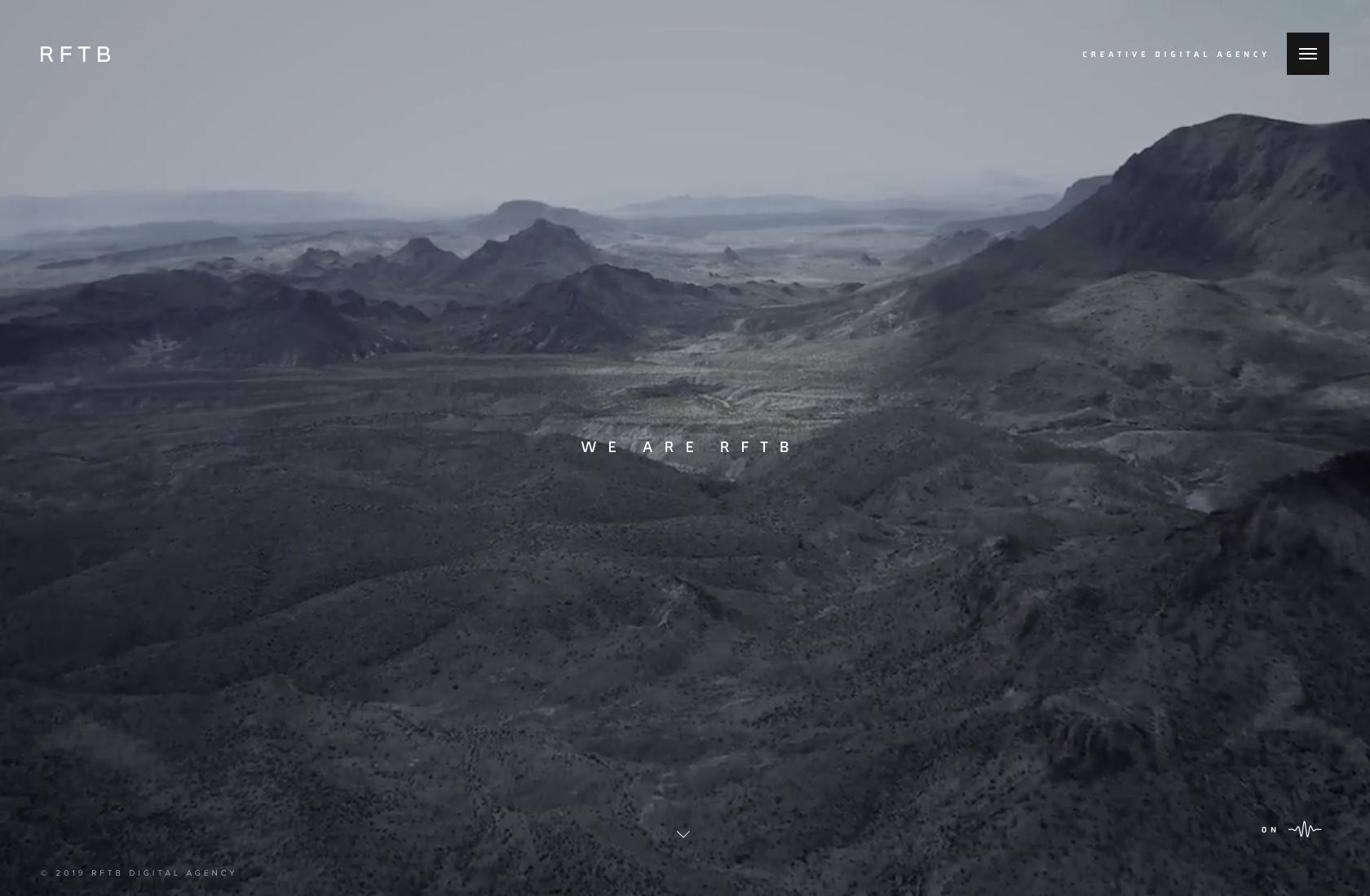
Placing a colored background behind RFTB’s hamburger menu makes it stand out.
Most commonly, hamburger menus will be used for main navigation, while kebab menus might be used for things like settings menus or other sub-menu types. While both are becoming more common navigational elements, some designers still add text to indicate that the hamburger is a menu. This is particularly useful if a site isn’t aimed at tech-savvy users.
Minimalist Color Palettes
There are a number of schools of thought on what makes a minimalist color palette. Plenty of minimalist sites use only two colors. Others use three, four, or more. A color palette alone will not make or break a minimalist web design.
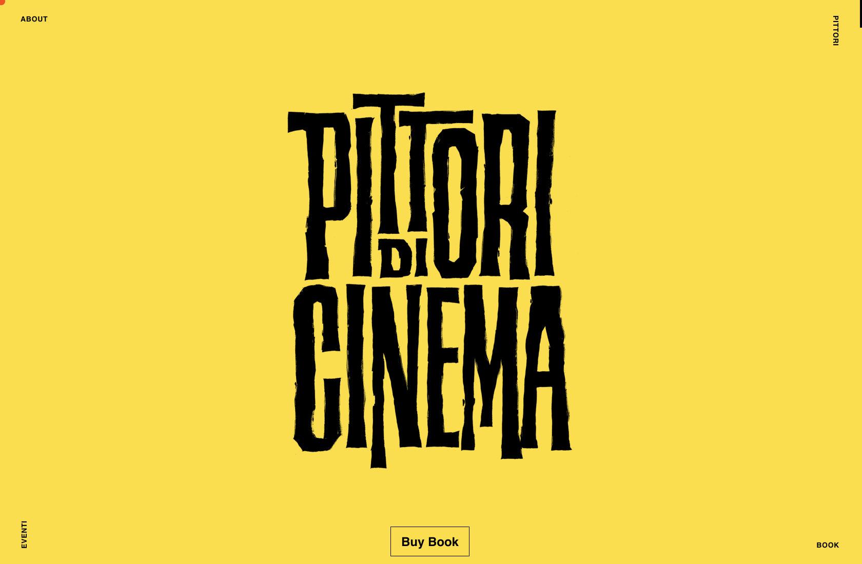
The Pittori di Cinema website uses a three-color palette for their home page (the cursor is red, while the background is yellow with black type).
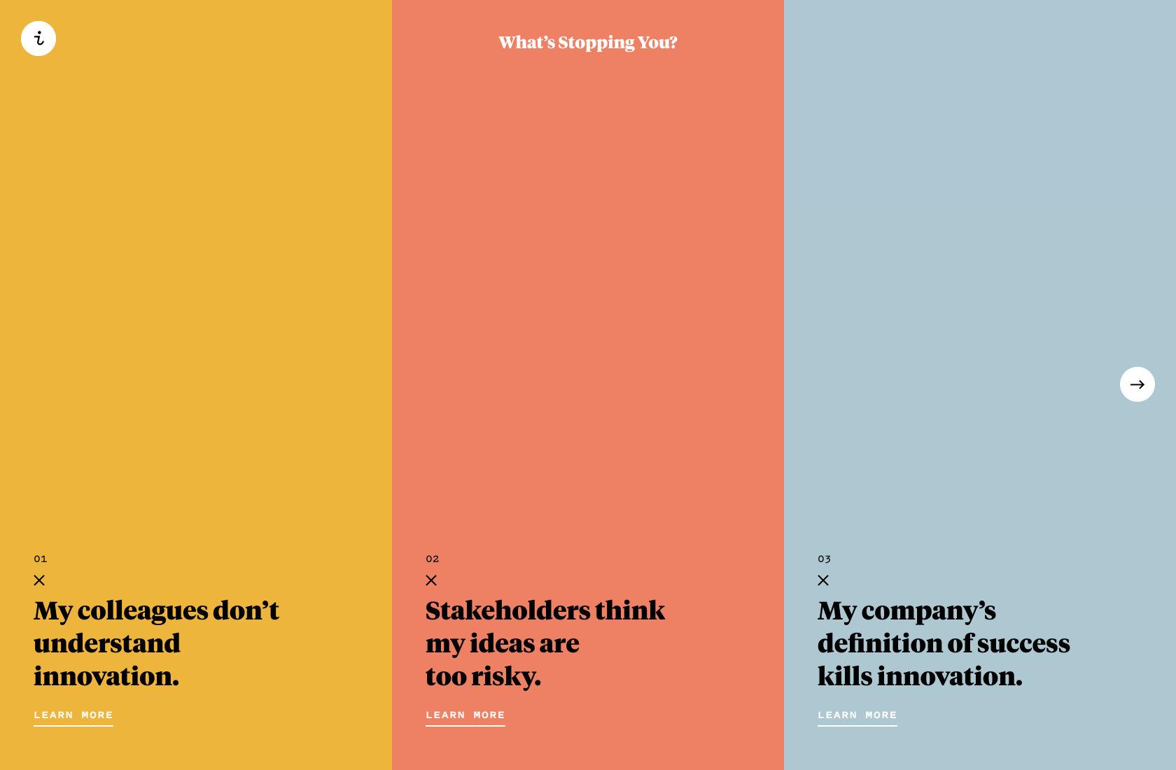
The website for Zeus Jones includes multiple colors, with each section using a different complementary color. The color blocks clearly delineate the sections while keeping the website design minimalist.
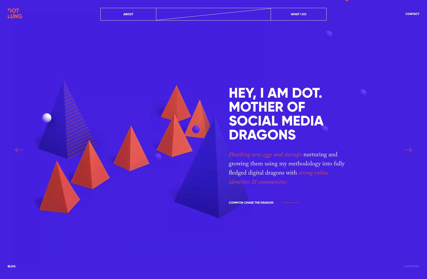
Dot Lung’s website uses a vibrant palette of purple, red, and white. It creates a sense of energy and modernity while maintaining a minimalist overall color scheme.
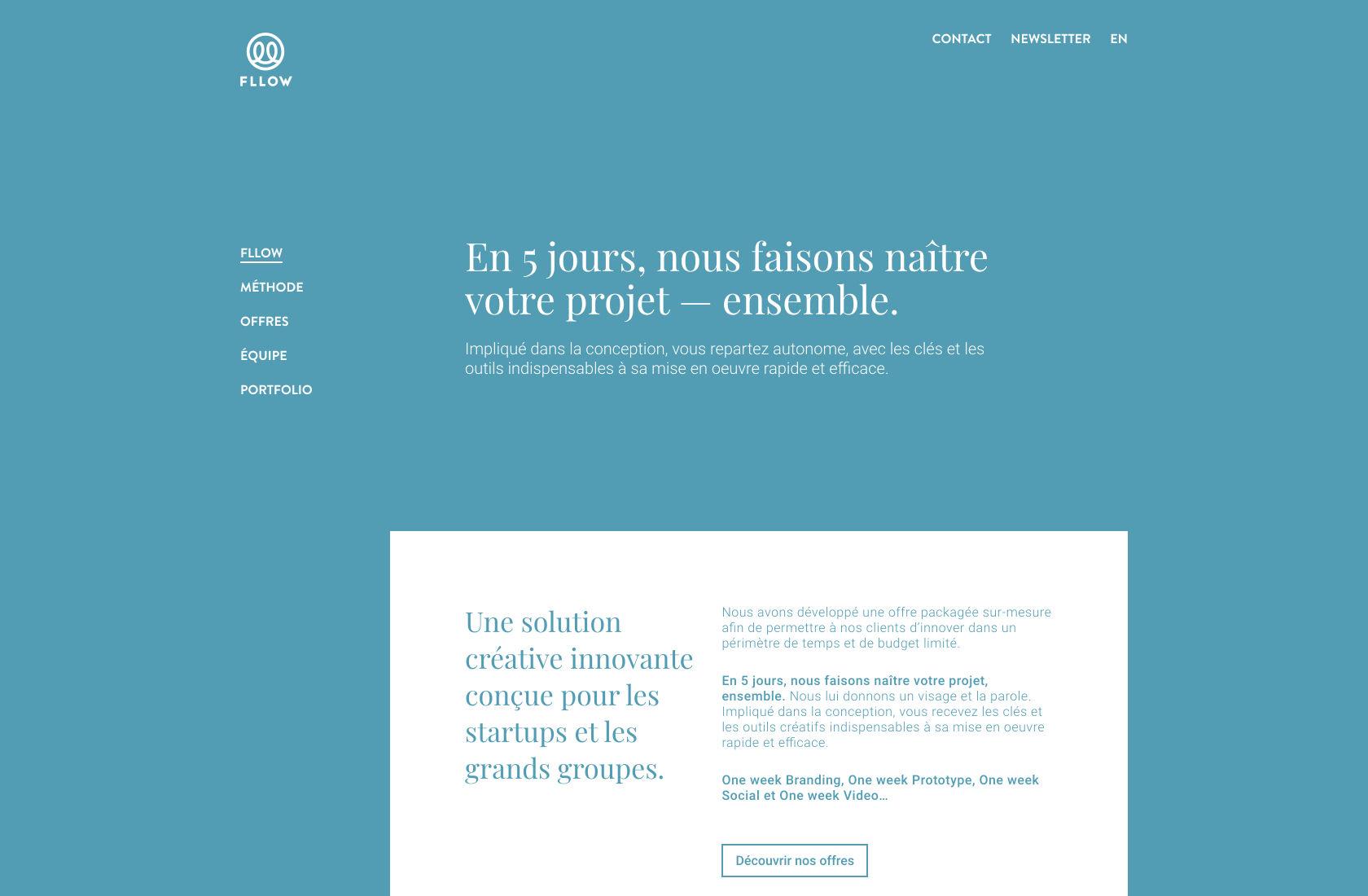
Fllow’s website uses a two-color palette, but the background color is constantly shifting. It’s a unique take on a very minimalist palette.
There are a lot of possible approaches to creating a color palette for a simple website design. But like all elements of a minimalistic web design, each choice needs to be intentional, and improve the overall user experience.
Conclusion
The biggest challenge that comes with minimalist design is that there is nothing for designers to hide behind. Each element of the design must prove its worth. Each element must be chosen deliberately, and be implemented perfectly in order for the design itself to excel.
Web designers who approach minimalist design as being easier than other design styles are often surprised at the amount of effort, time, and skill required to create a minimal design website that can achieve its aims in terms of user behavior and experience while maintaining a truly minimalist aesthetic.
Further Reading on the Toptal Blog:
Understanding the basics
What does negative space mean?
Negative space, also referred to as white space, is the empty or open space around design and/or content elements that gives them definition. Granted, this space can be filled with a background pattern or color, but it’s still space that isn’t being used in the same sense as other elements of the site.
What does it mean to be a web designer?
Web designers create UI and UX designs. Web designers are both creatively and technically inclined and use both skill sets to design or redesign websites. It combines page layout, graphic design, and sometimes content production skills.
What skills do you need to be a web designer?
Web designers need a variety of both creative and technical skills to create UI and UX designs. These skills include user research, determining technical and user requirements, creating web page layouts, coding, and graphic design.
